
Little Kitchen
A Pet Food Mobile Application
Project Role
UX/UI
Branding
Project
Concept Project
Tools
Figma
Adobe Illustrator
Deliverables
User Research
Personas
Problem Statements
User Journey Maps
Paper Wireframes
Digital Wireframes
Low-Fidelity Prototypes
Usability Studies
Mockups
High-Fidelity Prototypes
Accessibility
Completion
2 Weeks
Lil’Kitchen is an organic pet food app that strives to help pet owners learn and select appropriate pet food based on nutritional value.
The Problem
Busy workers lack the time necessary to learn about pet food nutrition.
Our pet food app will let users easily learn and analyze the ingredients in their pet’s food which will affect users who want to prolong their pet’s life by helping users make informed decisions.
The Goal
User Research
Pain Points
Time
Working adults are too busy to spend time learning about which pet food is bestPet Food Allergies
Pets can be allergic to certain ingredients in pet food. This can be a trial-and-error processUnderstanding Nutrition
Text-heavy information on pet food labels is difficult to understand


Summary
I conducted interviews and created empathy maps to understand the users I’m designing for and their needs. A primary user group identified through research was working adults who don’t have time to shop around in-stores for pet food.
This user group confirmed initial assumptions about Lil’Kitchen’s customers, but research also revealed that time was not the only factor limiting users from going to a retail store. Other user problems included obligations, interests, or challenges that make it difficult to get pet food in-person.
“Between more work responsibilities and training my new puppy, assessing nutritional value in pet food feels exhausting”

Problem Statement:
Alex is a busy senior accountant who needs an easy way to assess what pet foods to purchase because they have no time to figure out which foods will not flare up their dog’s allergies.
Alex Barett
Age: 30
Education: University graduate
Hometown: Austin, Texas
Family: Single, lives alone
Occupation: Senior Accountant
Alex is a Senior Accountant who lives in Austin, Texas. They recently got promoted in their accounting job, but it comes with more responsibilities. By leveling up their skills and creating positive relationships at work, they hope to get another promotion in a year or two.
They recently purchased dog food that has been highly rated and reviewed online, but their dog has been allergic to the food. They wish there were an easy way to prevent this from happening in the future.
Goals:
To level up skills and make authentic relationships at work
To get another promotion in 1-2 years
To make more time for outside activities with their pet
Frustrations:
“I don’t have a lot of time to learn about different pet foods.”
“I feel overwhelmed by too many pet food options.”
“My puppy has been showing allergies related to food, especially poultry.”
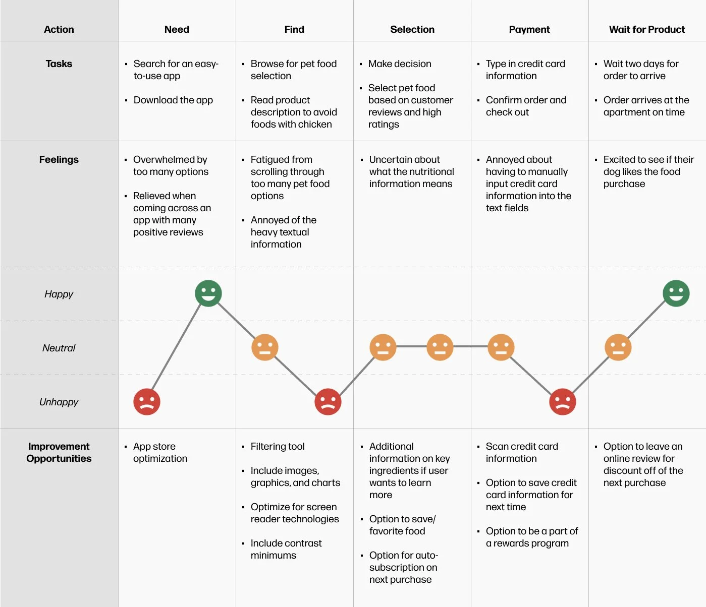
User Journey Map
Mapping Alex’s user journey revealed how helpful it would be for users to have an app that allows them to browse, learn, and make a decision on pet food that doesn’t flare up their pet’s allergies.
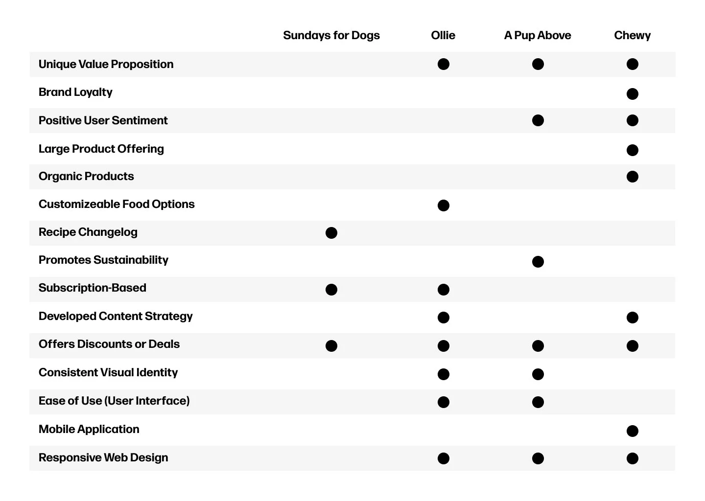
Competitive Audit
Copy goes here.
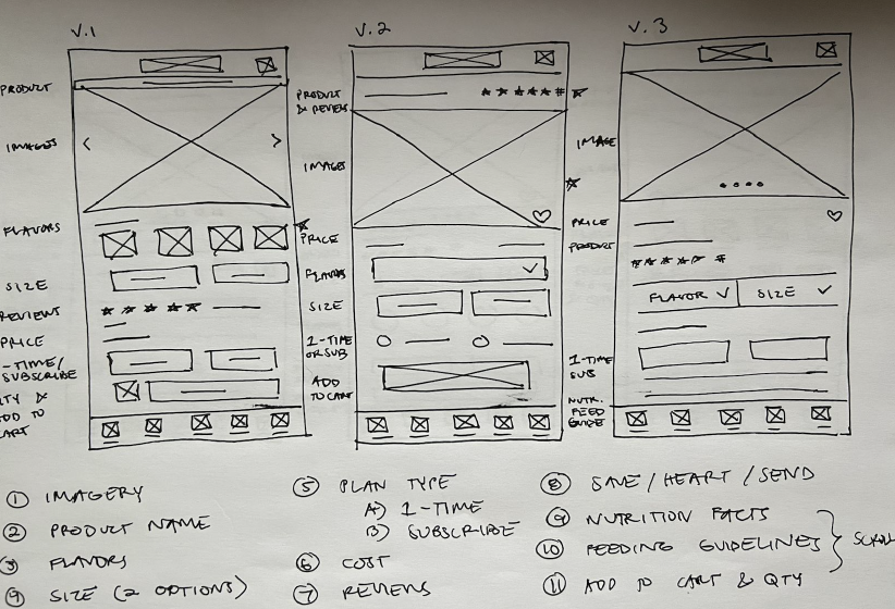
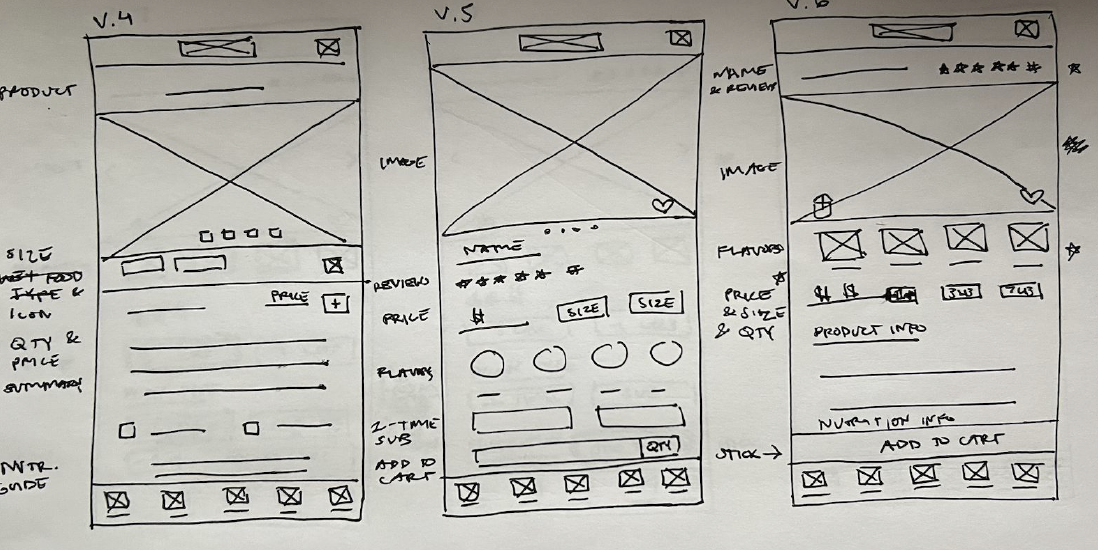
Paper Wireframes
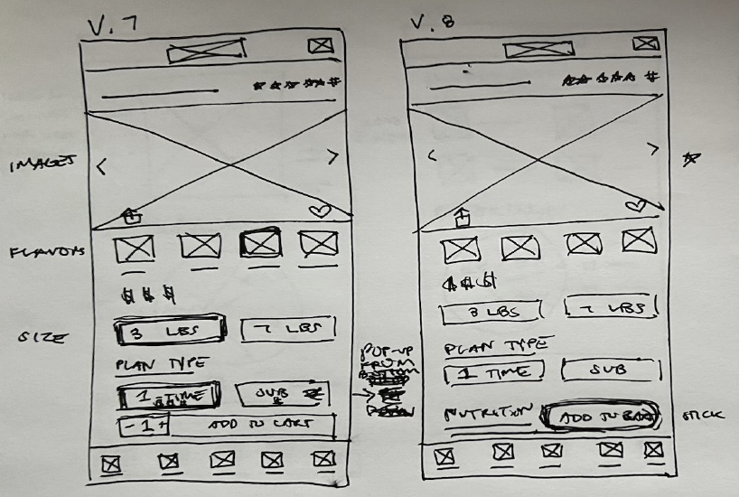
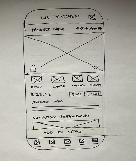
Taking the time to draft iterations of each screen of the app on paper ensured that the elements that made it to digital wireframes would be well-suited to address user pain points.
For the product detail screen, I prioritized a quick and easy ordering process that features product information, ingredients, and a nutritional breakdown pie to help users save time and quickly learn what food is best for their pet.
Digital Wireframes
As the initial design phase continued, I made sure to base screen designs on feedback and findings from user research.
Easy navigation was a key user need to address in the designs to ensure a quick, smooth process.


Low-Fidelity Prototype
Using the completed set of digital wireframes, I created a low-fidelity prototype.
Usability Study: Findings
-
Most participants need better cues for what steps are required to add items to cart
-
Majority of users preferred an added option to switch out their items directly from checkout
-
All participants found the nutritional breakdown feature useful
Round 1 Findings:
Round 2 Findings:
-
The shop by pet, food category, life stage, breed size, and allergens can be a one-time onboarding process rather than screens that returning users have to come back to each time
-
Returning users can be brought to the ‘Shop By Food’ screen
-
Copy here
Mockups
(Notes about goals and thought process)
Before usability study —> After usability study