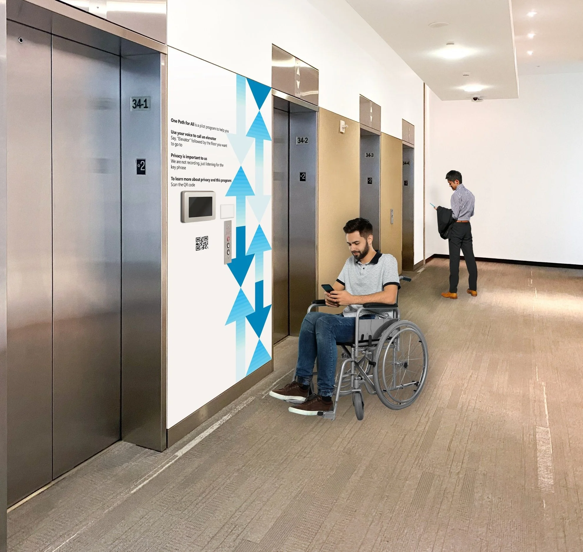
A Voice-Activated Elevator System
Microsoft Inclusive Elevators
Project
Microsoft
Location
Redmond, WA
Discipline
Environmental Graphics
User Experience
Completion
March 2022
Burgess Design and Microsoft Real Estate & Facilities teamed up to improve the workplace experience on the Microsoft campus.
Through a pilot program, we aimed to create an inclusive meeting space for the new hybrid workplace, starting with elevator lobbies for two buildings.
The Challenge
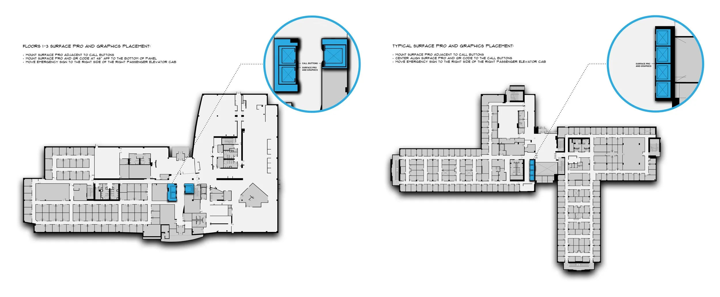
Create an inclusive and accessible solution that can be further expanded and implemented in buildings across campus once the feasibility study was over.
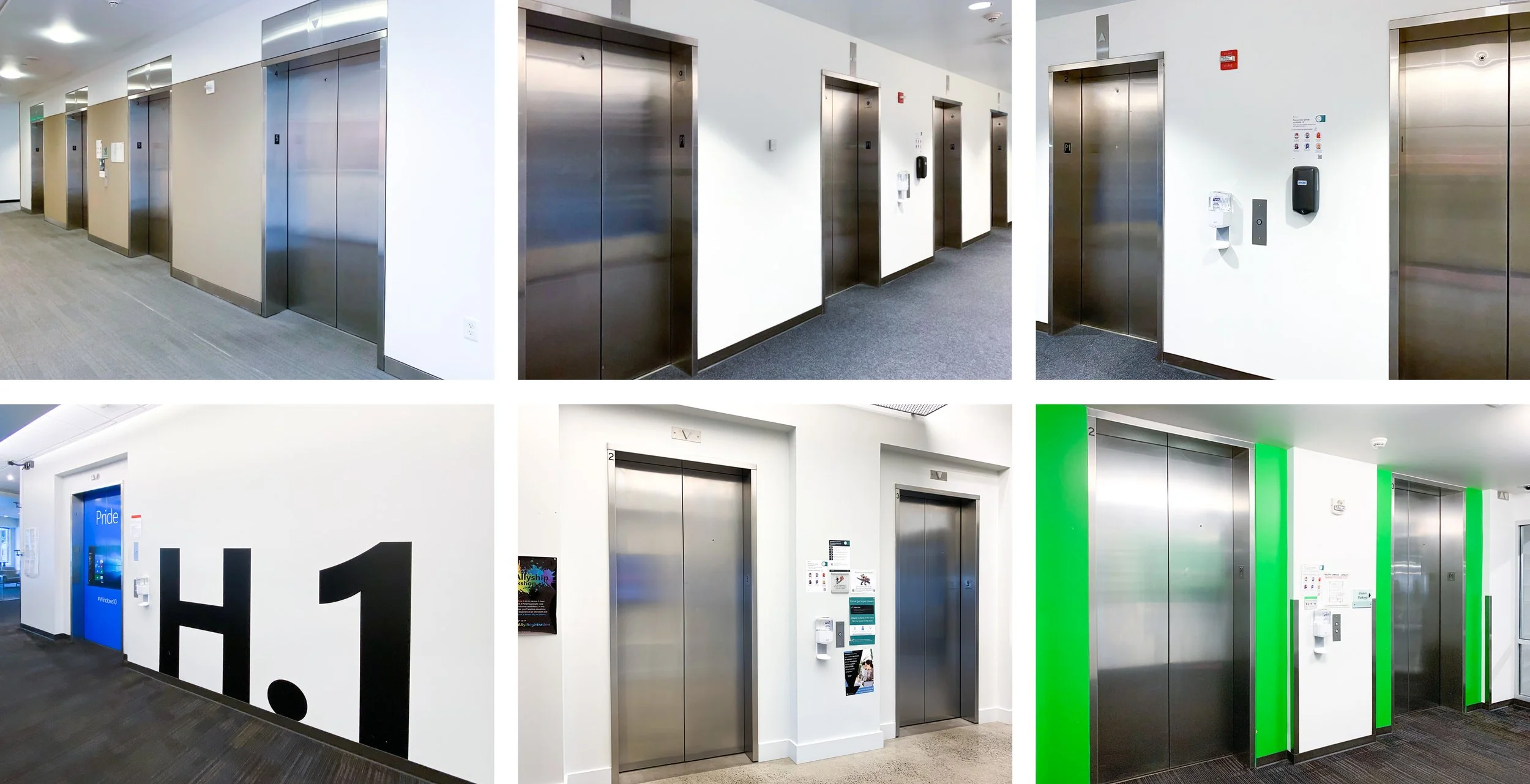
Existing Conditions
Amid the COVID-19 pandemic, paper signage and sanitizing stations were displayed next to elevator call buttons throughout the buildings as temporary safety measures.
The existing conditions excluded people with permanent, temporary, and situational disabilities and were inefficient.
By using inclusive design principles, our team believed there was room to improve upon in order to benefit people universally.
The Process
Through a lean UX process, we explored user problems, built out a minimum viable product, and refined the design through feedback from project stakeholders.
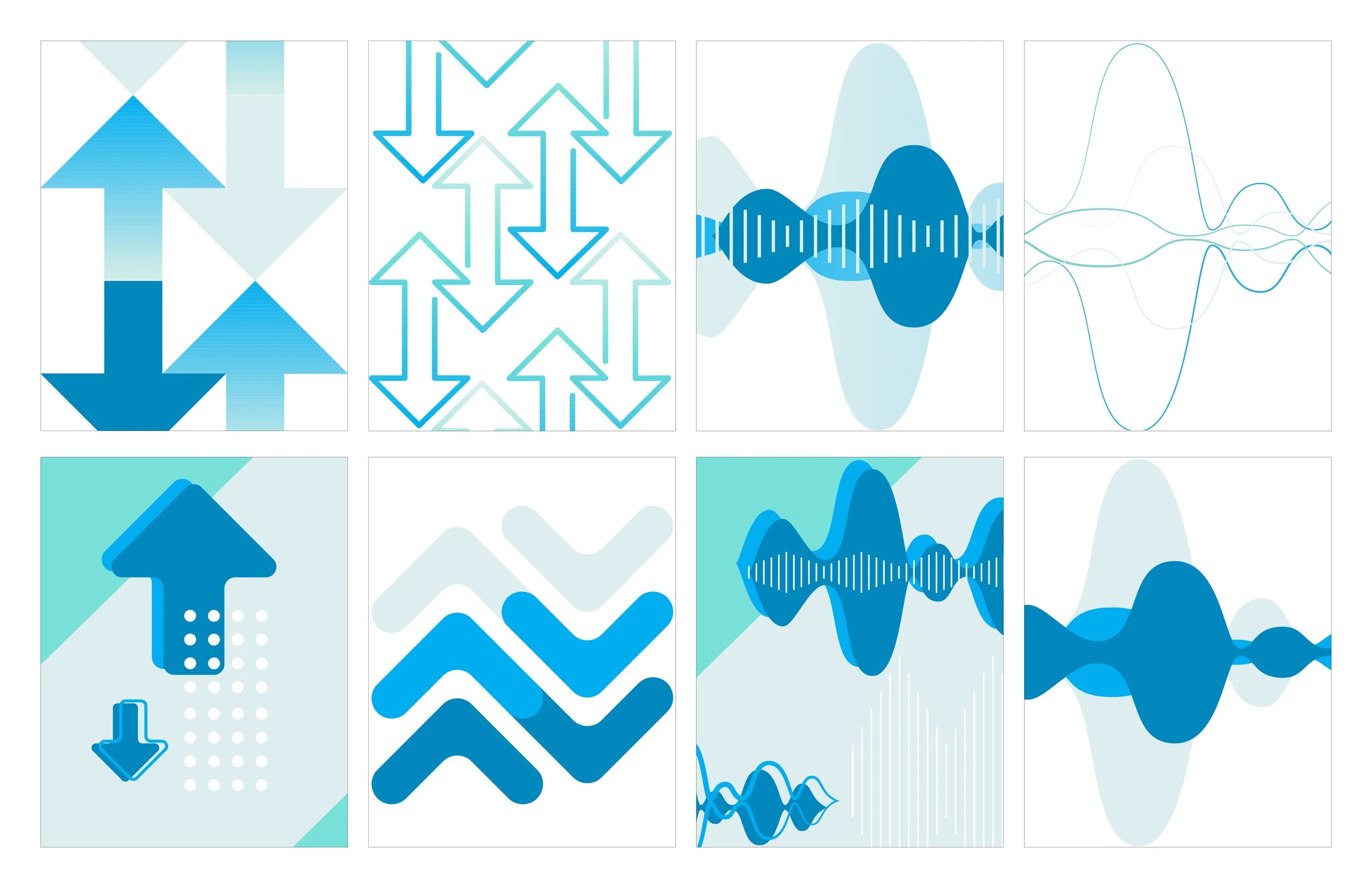
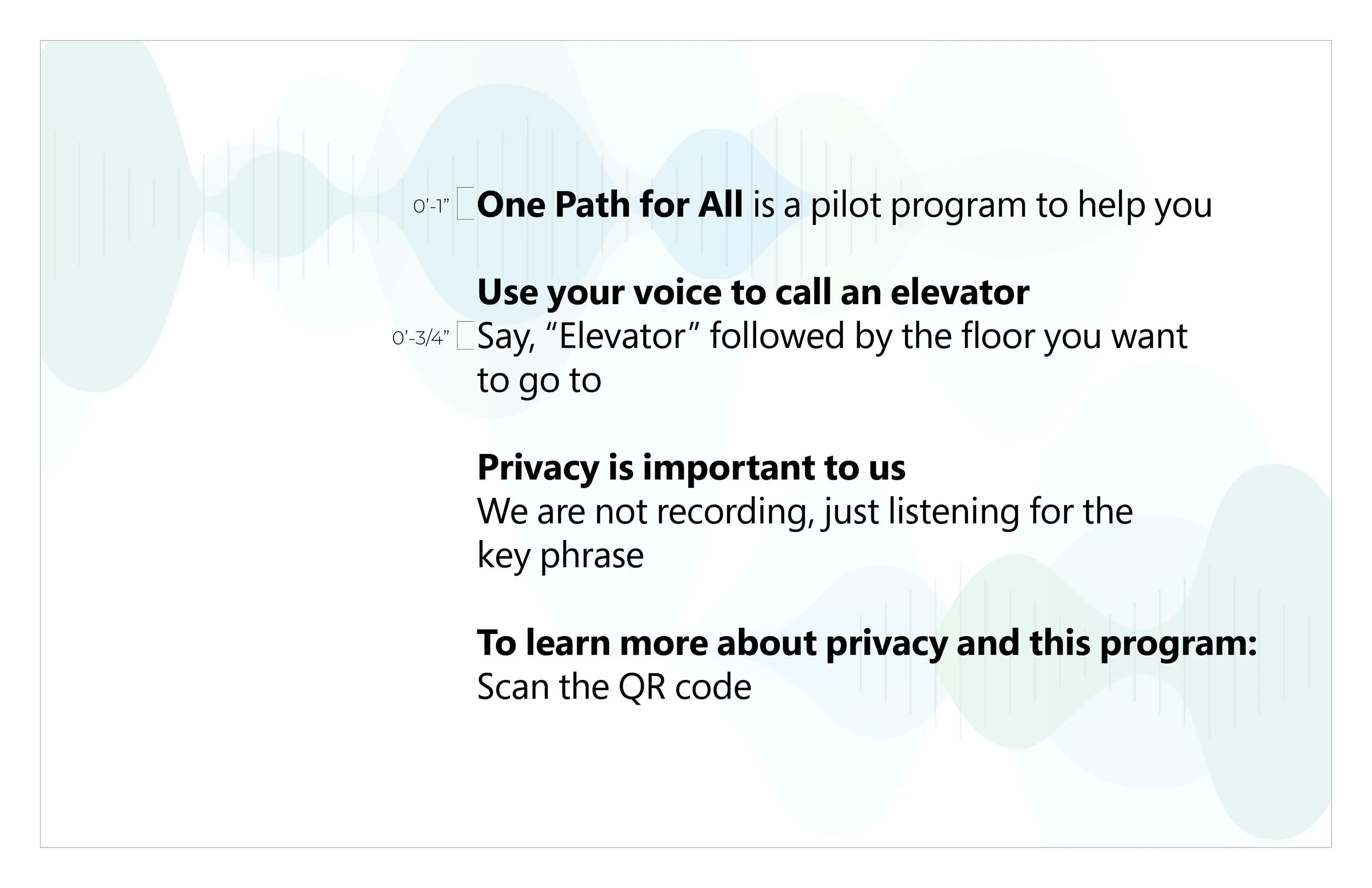
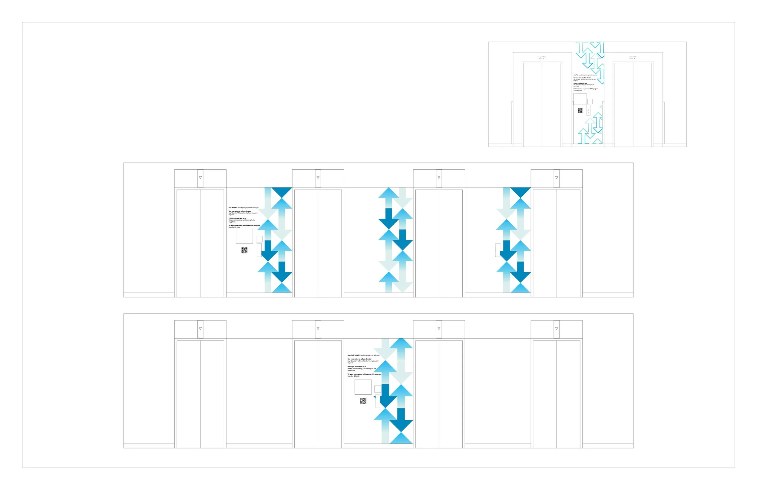
My responsibility was to consider challenges that users might face when learning how to interact with the product and solve them through environmental graphics. I created a kit of environmental graphics adhering to Microsoft brand guidelines and allowed for interchangeability in multiple settings. I ensured the messaging was concise, the design elements were within building code regulations, and the device placement complied with ADA standards.
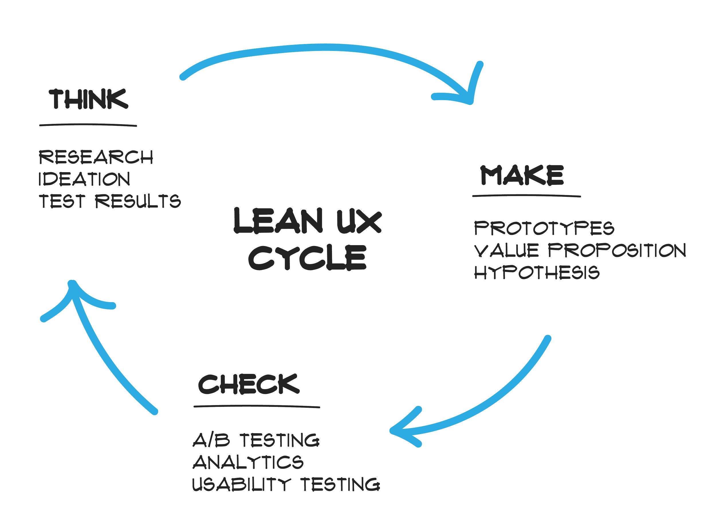
Think
More than 1 billion people in the world identify as having a disability.
Building experiences that are accessible can make a difference in people’s everyday lives.
By supporting people across the spectrum of disabilities, we are thinking of the user at all stages of the development process to build a usable, delightful, and connected experience.
Make
I started by creating sketches of what the graphic elements can possibly look like.
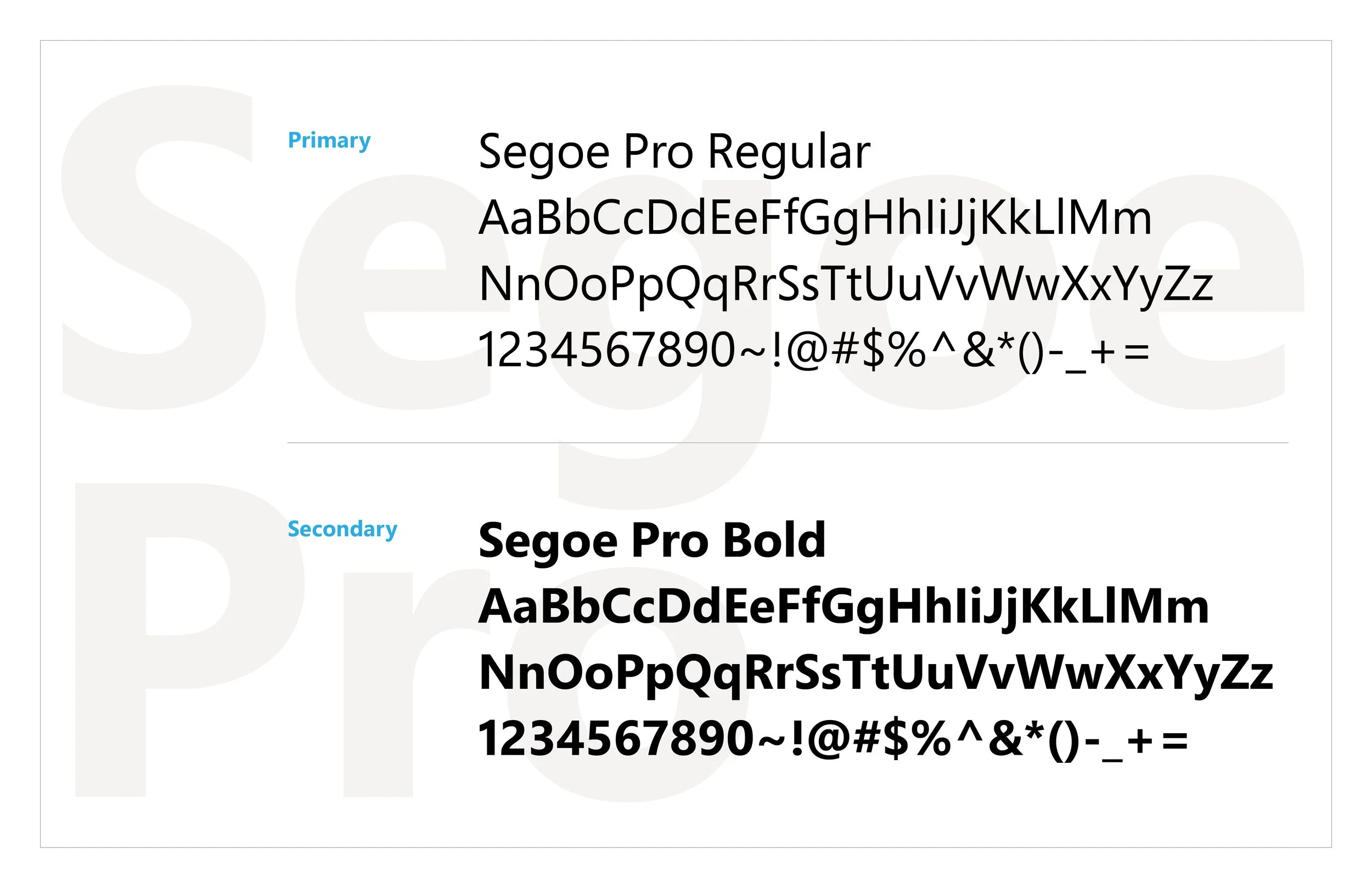
I focused heavily on graphic legibility through typography, size, height, weight, kerning, and color contrast. I also considered braille placard location, use of symbols, and other factors.
Through a series of iterations and feedback, we landed on a prototype, which was then printed and tested on site.
Check
All versions of environmental graphics were tested for feedback from project stakeholders.
I made adjustments accordingly and repeated the necessary steps.
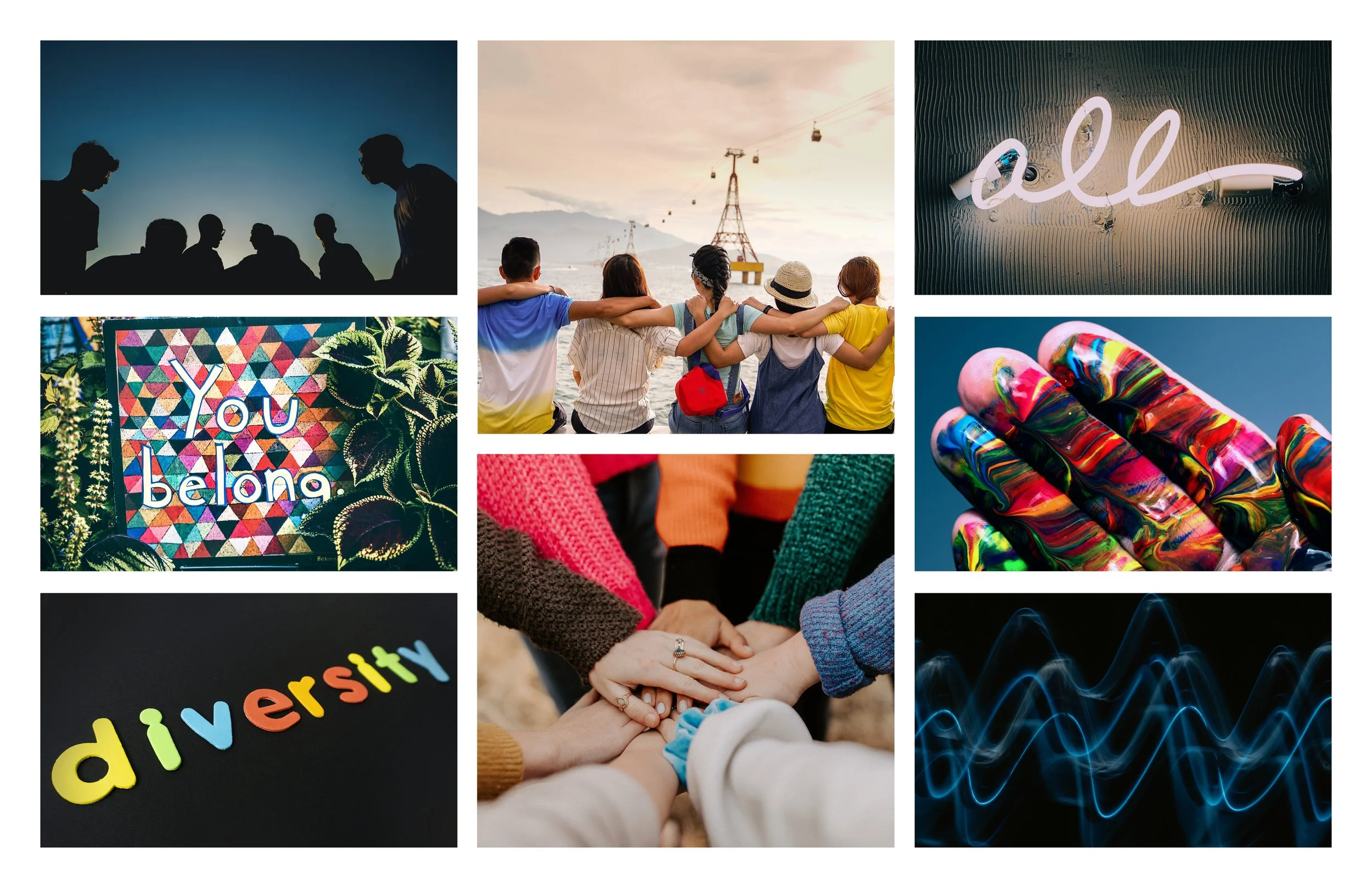
Human-Centered, Inclusion, Diversity, Accessibility
Human-Centered, Inclusion, Diversity, Accessibility

The Outcome
*Project completed while at Burgess Design